
The Evolution: How Google’s Algorithm Shifted to Mobile-First
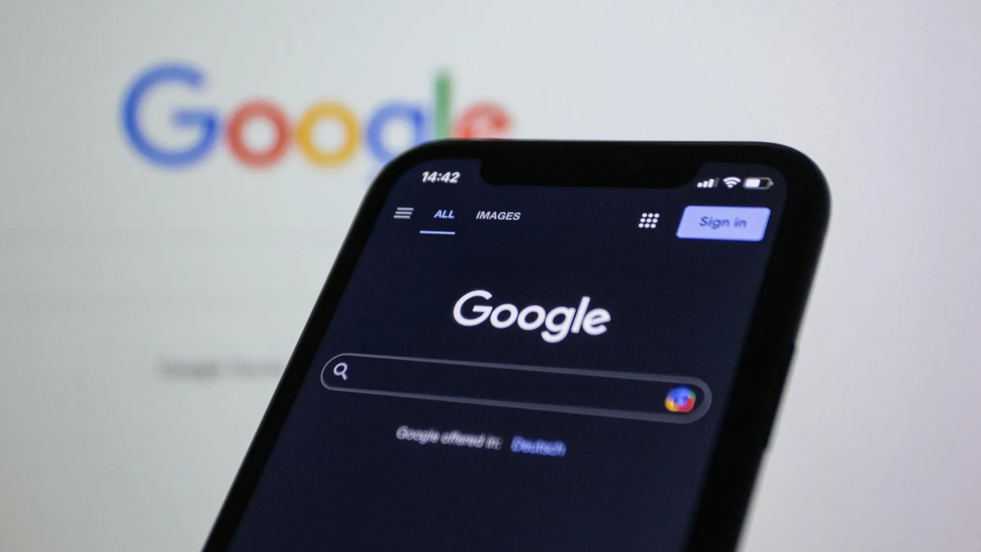
Explore how Google’s algorithm evolved to mobile-first indexing and why adapting your website for mobile is essential for staying visible, competitive, and customer-friendly in today’s digital world.
It’s easy to forget how much the web has changed in just a few years. Today, most of us browse, shop, and search on our phones, but it wasn’t always this way.
In fact, over 60% of all searches now happen on mobile devices, and UK consumers spend an average of more than four hours a day on their smartphones (Ofcom, 2024).
Google reports that mobile-friendly sites are 67% more likely to convert visitors into customers. Google’s move to mobile-first indexing is the result of these dramatic shifts in user behaviour.
Understanding this change can help your business stay ahead of the curve and make smarter choices about your website.

The Desktop-First Era
For years, websites were designed for desktop computers first. Mobile phones were an afterthought, if they were considered at all. This meant:
- Websites looked great on big screens, but were hard to use on mobiles
- Slow load times and awkward layouts on phones
- Many businesses missed out on mobile traffic and leads
The Turning Point: Mobile-Friendly Updates
By 2015, mobile browsing had exploded. Google responded with the “Mobilegeddon” update, which began rewarding mobile-friendly sites with better rankings. This was a wake-up call for businesses everywhere, if your site wasn’t easy to use on a phone, you could lose visibility in search results.
The Rollout of Mobile-First Indexing
Between 2016 and 2018, Google rolled out mobile-first indexing in stages. Here’s what changed:
- Google started using the mobile version of websites as the primary source for indexing and ranking
- Sites with poor mobile experiences saw their rankings drop—even if their desktop sites were strong
- Businesses began to prioritize mobile design, speed, and usability
What Does This Mean for You?
Mobile-first indexing is now the standard for every site. If your website isn’t designed for mobile from the ground up, you’re at a disadvantage. The good news? Making your site mobile-friendly doesn’t just help with Google, it creates a better experience for your customers too.
Looking Ahead
Google continues to refine its algorithms, but one thing is clear: mobile isn’t a trend, it’s the new normal. Investing in a mobile-first website today helps future-proof your business for whatever comes next.
Up Next:
In our next post, we’ll break down the difference between “responsive design” and “mobile-first design”, and why it matters for your business.
Want to know how your current site stacks up? Contact us for a free mobile audit or stay tuned for more Website Wednesday tips!